Here’s something to mark World Usability Day.
Boots does a thing called Meal Deal which means for a fixed price you can get a sandwich, drink and snack/dessert.
There are two types of meal deal, one where the products are marked with a red circle and the slightly more expensive option which uses a green circle.
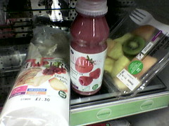
So you might expect the contents of this picture form a green meal deal, right?

Wrong 🙁
Move a little closer and you’ll see the green circle on the fruit ins’t a “Meal deal” green circle but a “Try me” green circle, with very small print saying “cannot be purchased as part of a green meal deal.”
I wonder if the packaging and labelling designers realised how much trouble they’d be causing by letting a bit of confusing information design through?
Yesterday I witnessed a 10 minute delay in a queue in a Boots store cause as a direct result of this. I wonder how many other times that’s happened.
Gestalt, not.
interesting… however as a boots employee i can tell you that the green label on the fruit salad actually reads “try me as instead of a sandwich as part of a green meal deal” so there :P, the fruit salad does not count as a snack or dessert under the deal admittedly but nonetheless it is part of the meal deal!
Adam, thanks for clarifying.
It’s still confusing though, don’t you think?
Fruit salad is more dessert than main for me.
Note to self: read the small print.
🙂
Maybe it’s intentional. The “Try Me” green labels are intended for marketing purposes, and confusing customers could be very profitable way to introduce them to new products. My guess would be that the meal system encourages customers to settle into a routine, which the store probably doesn’t want. The green lookalike labels might be a way to offset this side-effect.
From the perspective of the customers, it’s ghastly.